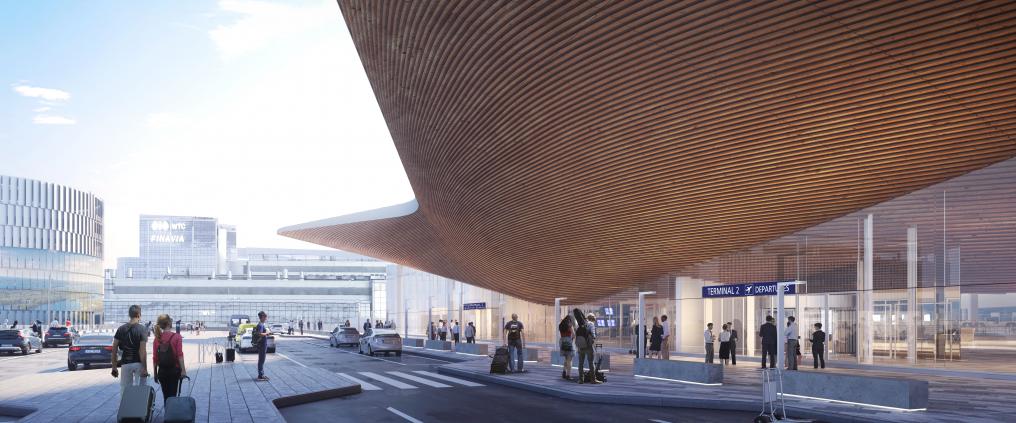
After the completion of the Terminal 2 extension at Helsinki Airport, moving around the airport will become smoother and more pleasant. In addition to the smooth customer experience, the design of the airport extension makes the experience enjoyable as well: the visit to the airport will be an invigorating and memorable experience also for passengers who transfer flights at Helsinki Airport.
“Designing the new entrance building challenged us to really think about what a representation of Finland should look like. The building’s mission is to be a gateway to Finland,” says main designer of the Terminal 2 extension Juho Grönholm of the architecture firm ALA. The goal was also to restore a sense of adventure and romance to air travel.
The task of the architects who won the architectural competition for Terminal 2’s extension and alteration work was to figure out how to ensure smooth travelling between the various parts of the airport that had been completed at different times, as passenger numbers are expected to grow in the future.
“We have sought solutions that make the choreography of air travel as easy and effortless as possible for passengers,” Grönholm says.
“For passengers arriving in Finland, it will be easy to continue their journey from the airport: taxis can be found on the left side of the building, the buses on the right and the Ring Rail Line connection right in front.”
Colours, materials and design will guide passengers
The departing and arriving passenger flows have been separated to different floors, following the logic of the old terminal building. Between the new entrance building and the old Terminal 2, there is a lower building section that is blue and box-like. This section houses the security control lines for departing passengers on the upper level as well as the baggage claim hall and customs facilities for arriving passengers on the lower level.
As soon as they enter the building, departing passengers will be able to see the fully blue security control area at the back of the departures hall. The box-like connecting section also stands out from outside and is even noticeable from the window of a landing plane.
“The idea behind the blue security control area is that by using the colour we are able to make security control as pleasant and smooth as possible. You will be able to see the blue colour from afar through the large windows when you arrive at the terminal. This makes it easy for passengers to navigate through the terminal,” says Grönholm.
“Many studies have also shown that the colour blue has a calming effect. Some passengers may find going to security control stressful. The experience may be more pleasant in a blue space.”
Instead of making the space look visually neutral, the colour and material choices seek to introduce lots of contrasts: bright blue ceramic tiles, bold white surfaces and warm, tangible wood.
The ceiling directs the gaze up towards the sky
Many airports’ architecture reflects themes of lightness and flight, but Helsinki Airport’s terminal extension looks at these themes from an unusual perspective, playing with impressions of lightness and heaviness. For example, the undulating wooden ceiling of the departures hall looks thick and heavy instead of light and airy. The ceiling continues past the glass facade to become wooden curved overhang.
“We wanted to introduce the themes of aviation and flying to the building in a slightly different way. For example, a jumbo jet taking off involves a contradiction: how can something so big stay in the air? In the new terminal, we have sought to reflect this massiveness with a heavy ceiling that reaches very low in parts of the terminal. The tallest passengers may even be able to touch the ceiling’s wooden surface at its lowest parts.”
“The material of the ceiling is Finnish spruce. The ceiling is built of wood boards cut in curved shapes. The shapes of the boards’ edges resemble the contour lines seen in maps. The ceiling’s surface is a kind of an abstraction of a natural landscape or an upside-down 3D map,” says Grönholm.
“The shapes in the ceiling will direct passengers’ gazes towards the direction of their journey, the sky above the runways.”
Finnish nature becomes part of the airport’s architecture
The terminal extension’s design decisions highlight Finnishness and things that help the passenger realise that they have just arrived in Finland. In addition to having wood – which is important for Finnish construction – present in the terminal’s ceiling, we wanted to bring nature to the space with the large Luoto diorama.
“After customs, passengers arriving in Finland will come across a green space consisting of boulders, heather and trees. There is an opening in the ceiling of the arrivals hall above Luoto, and the ceiling of the departures hall above has a large skylight in the same spot. This allows the plants and trees to receive natural light, arriving passengers to see the wooden ceiling of the departures hall and the departing passengers to see the tops of the diorama’s trees.”
Finnishness is present in the decisions of the entire Helsinki Airport Development Programme throughout the project, as the domestic content of the entire EUR 1 billion programme is about 90%.
This article is part of Finavia’s Future of the HEL-article series. We will open the doors and welcome all to the Airport of the future 1st of December 2021.


